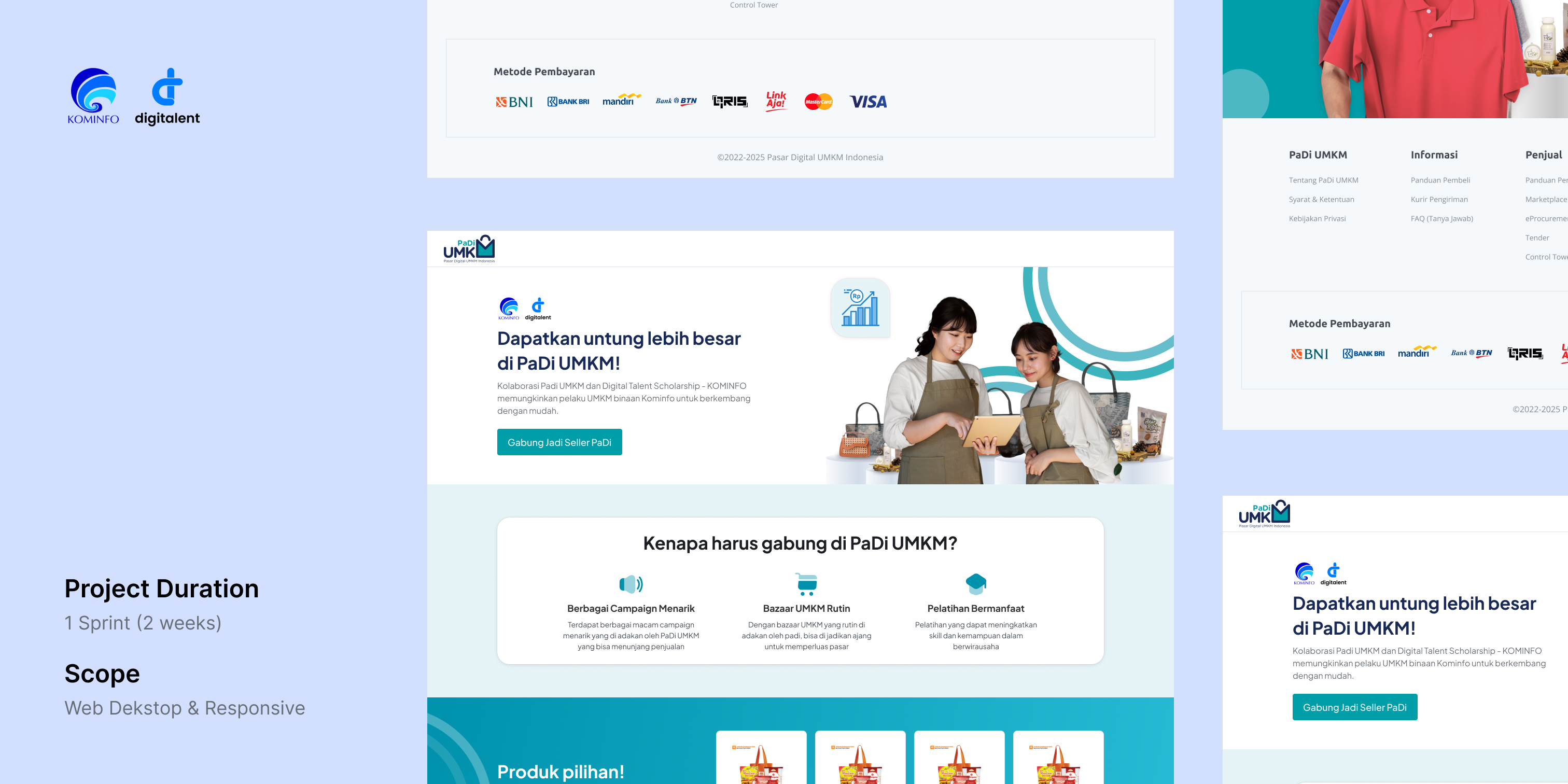
The Digital Entrepreneurship Academy (DEA) program is a scholarship for micro, small, and medium-sized enterprises (MSMEs). This program is part of the Digital Talent Scholarship developed by the Ministry of Communication and Information of the Republic of Indonesia, which also collaborates with PaDi UMKM with the aim of providing a platform for MSME entrepreneurs who wish to upgrade their skills in utilizing digital technology to enhance their businesses.
PaDi UMKM provide training facilities related to MSMEs and covering legal aspects to the utilization of digital technology that can later be implemented directly by becoming a seller on PaDi UMKM. There are various benefits offered to users who register as sellers on PaDi UMKM through DEA, including attractive campaigns, regular bazaars, and valuable training opportunities.
The lack of information access regarding PaDi UMKM for the DEA-assisted MSMEs, causing DEA-assisted MSMEs have no insight or understanding about PaDi UMKM that has an impact on the low number of DEA-assisted MSMEs that are acquired to become sellers in PaDi UMKM.
Now, here come the design challenges:
How might we create a page that contains information about PaDi UMKM while also encouraging DEA-assisted MSMEs to join as sellers on PaDi UMKM?
The users of this page are DEA-assisted MSMEs who have registered their accounts at digitalent web.
My role is ui/ux designer, I collect the requirements, sketching, create wireframes, final design, and present the design to my leader.
In this process, I try to dig deeper into the issues, goals, and scope. The process is carried out using the Zoom meeting platform, which is also attended by representatives from the Ministry of Communication and Information Technology. These are notes that I took after the meeting:
●
They want a uncluttered UI, easy to read and navigate.
●
It's okay to use components and styles from the PaDi UMKM design system library, including colors, buttons, and icons. However for the font, the Ministry of Communication and Information Technology prefers a font with the Jakarta Sans plus type.
After completing a fairly clear requirement gathering process, the solution I propose here is a landing page serving as the entry point for registering as a seller on PaDi UMKM. It will display high-priority information such as the benefits of joining as a seller in PaDi UMKM, featured products that can serve as references for the types of products that can be sold on PaDi UMKM for prospective sellers, the seller registration process, and testimonials from DEA-assisted MSMEs sellers who have already become sellers on Padi UMKM. This is intended to attract the interest of DEA-assisted MSMEs to join as sellers on Padi UMKM
Here are design references that I took from the landing page design of competitors or similar companies. Here, I focus on the layout and how to present its structured content information
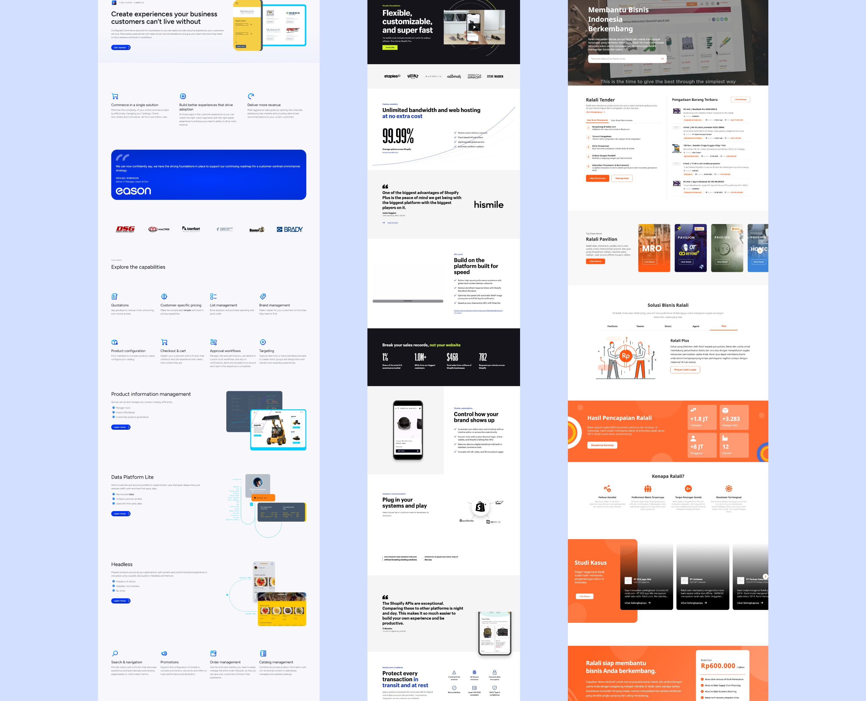
Web inspiration
This IA is very useful to see how big the scope is and also as my guide when designing the pages. When the IA is done, i sent it to my lead for approval before continuing to the next step, skecth.
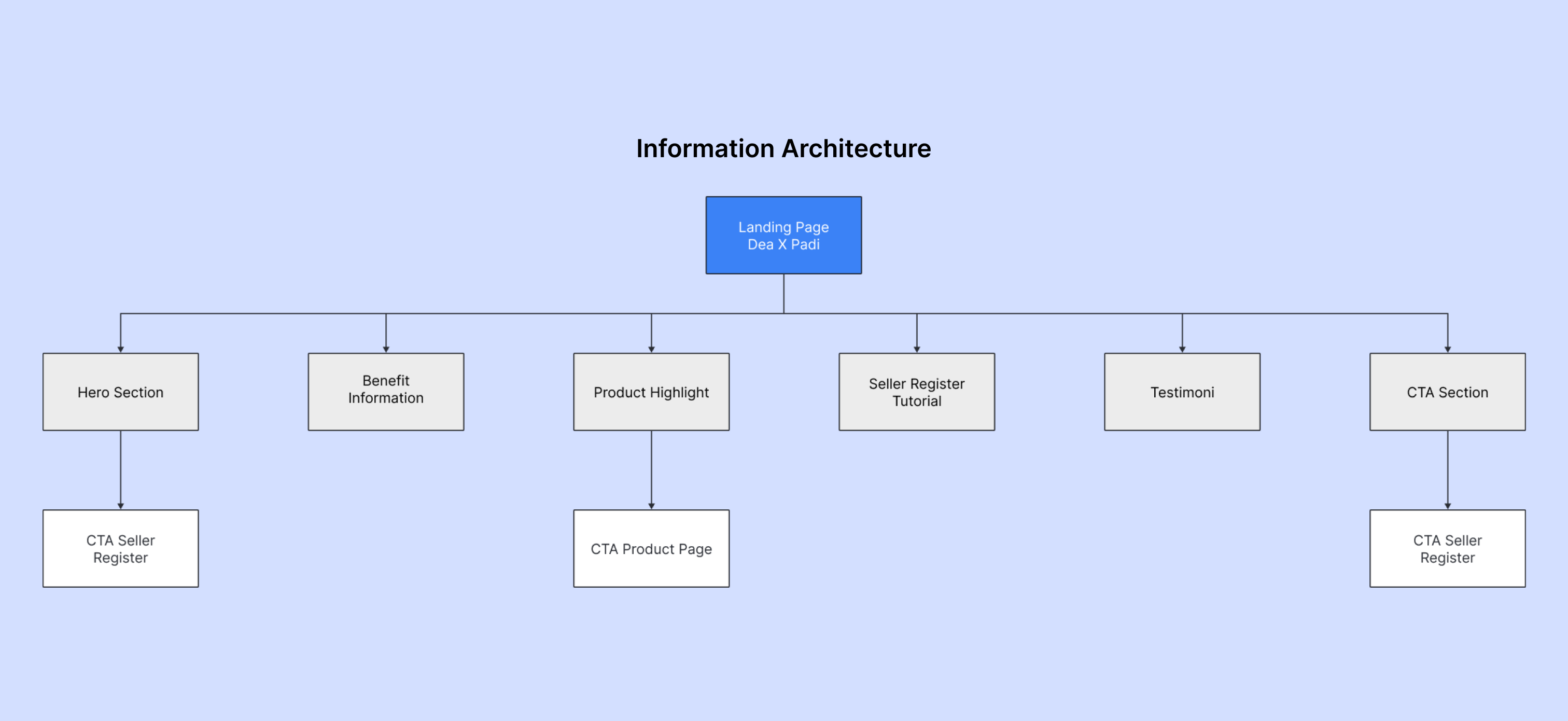
Information Architecture of Landing Page DEA X PaDi UMKM
I create sketches on paper, which makes it easier for me to explore designs without limitations compared to using digital media. In this process, I explore design by considering the layout and placement of content on the landing page.
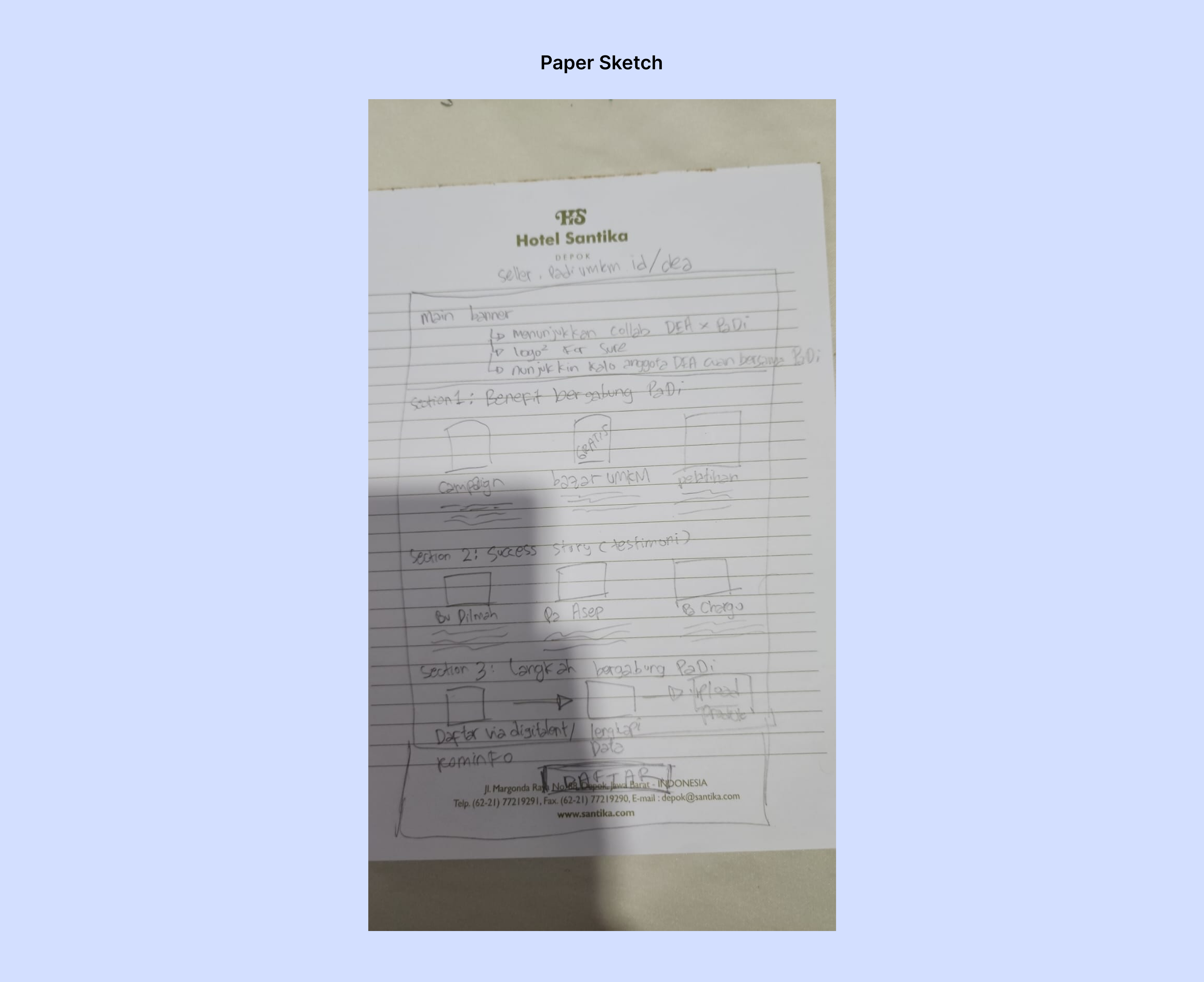
Paper Sketch
Wireframe always helped me visualise what the content are and how many pages are there.
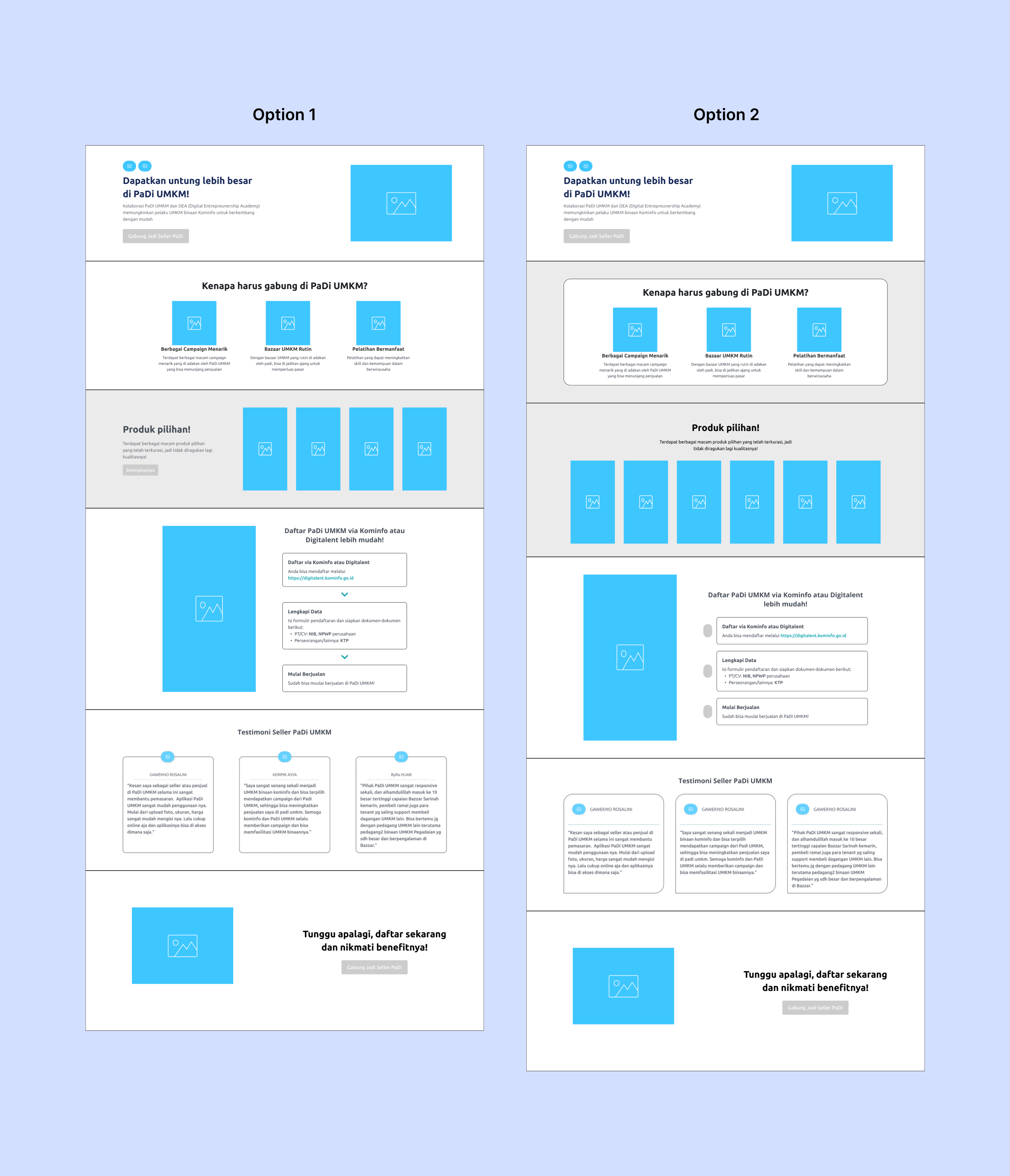
Wireframe
There are two different design options in terms of the use of elements and layout in each section. After completing these two variants, I presented them to my lead, and there are still revisions in this options.
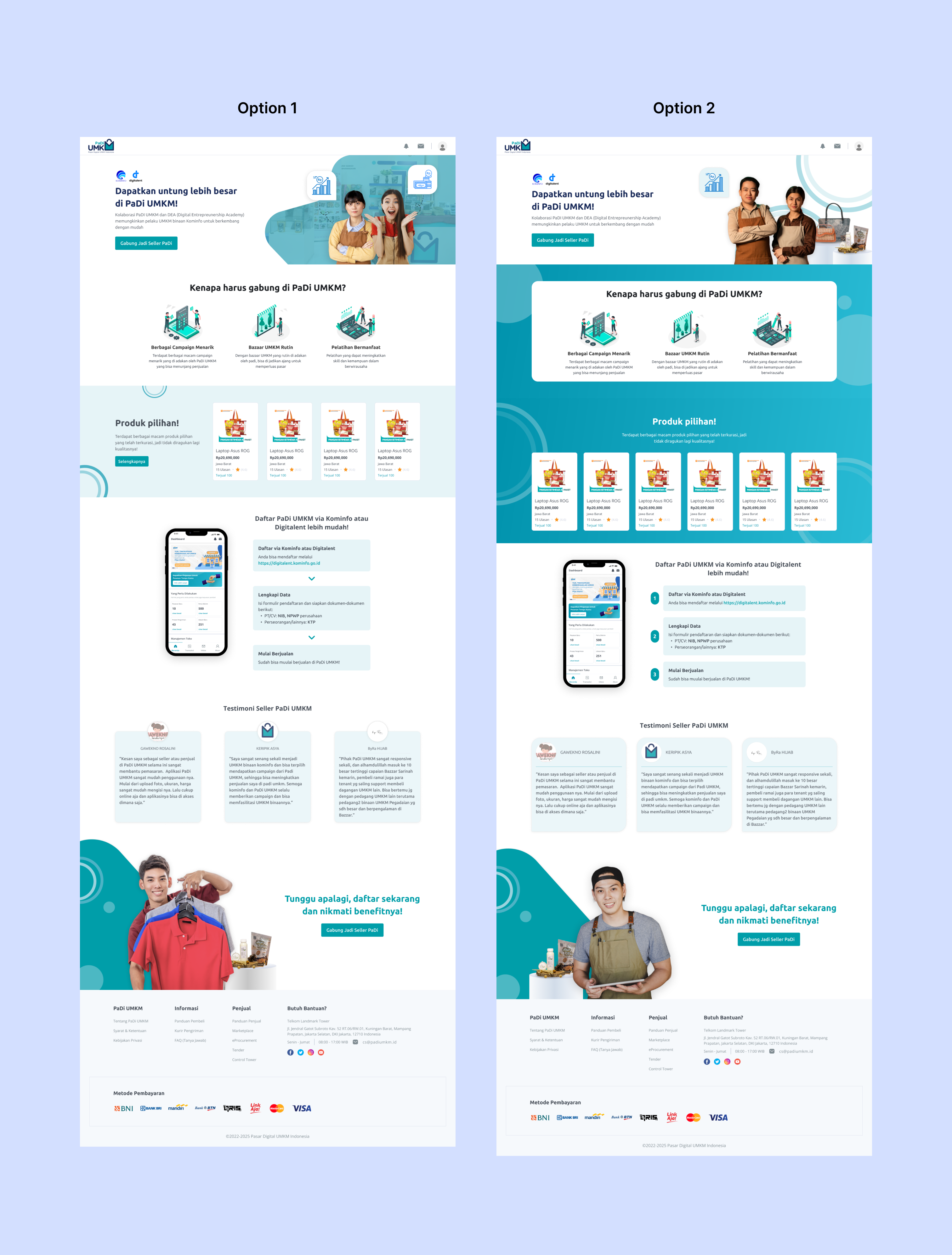
Design Option
Revisions provided by my lead is the use of illustrations in the benefits section should be avoided, as users may find it difficult to skimming through. Instead, consider using more minimalist icons. Additionally, each section's separator needs to be clarified further. The last one, in the product highlight section, it is better to use option 1.
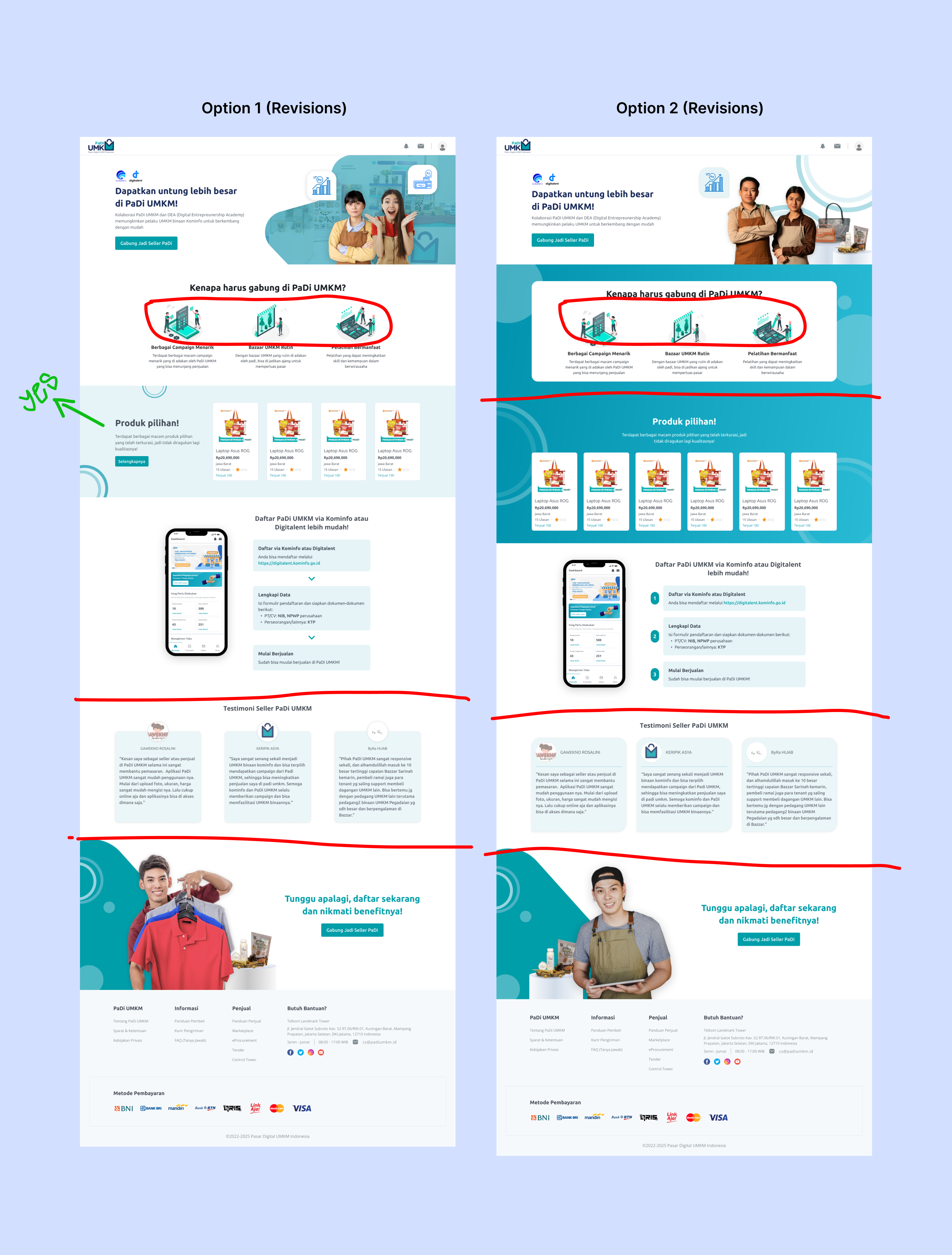
Design Revisions
Here is the result of the revised design that I have worked on. Following that, my lead has been able to choose the options I created.
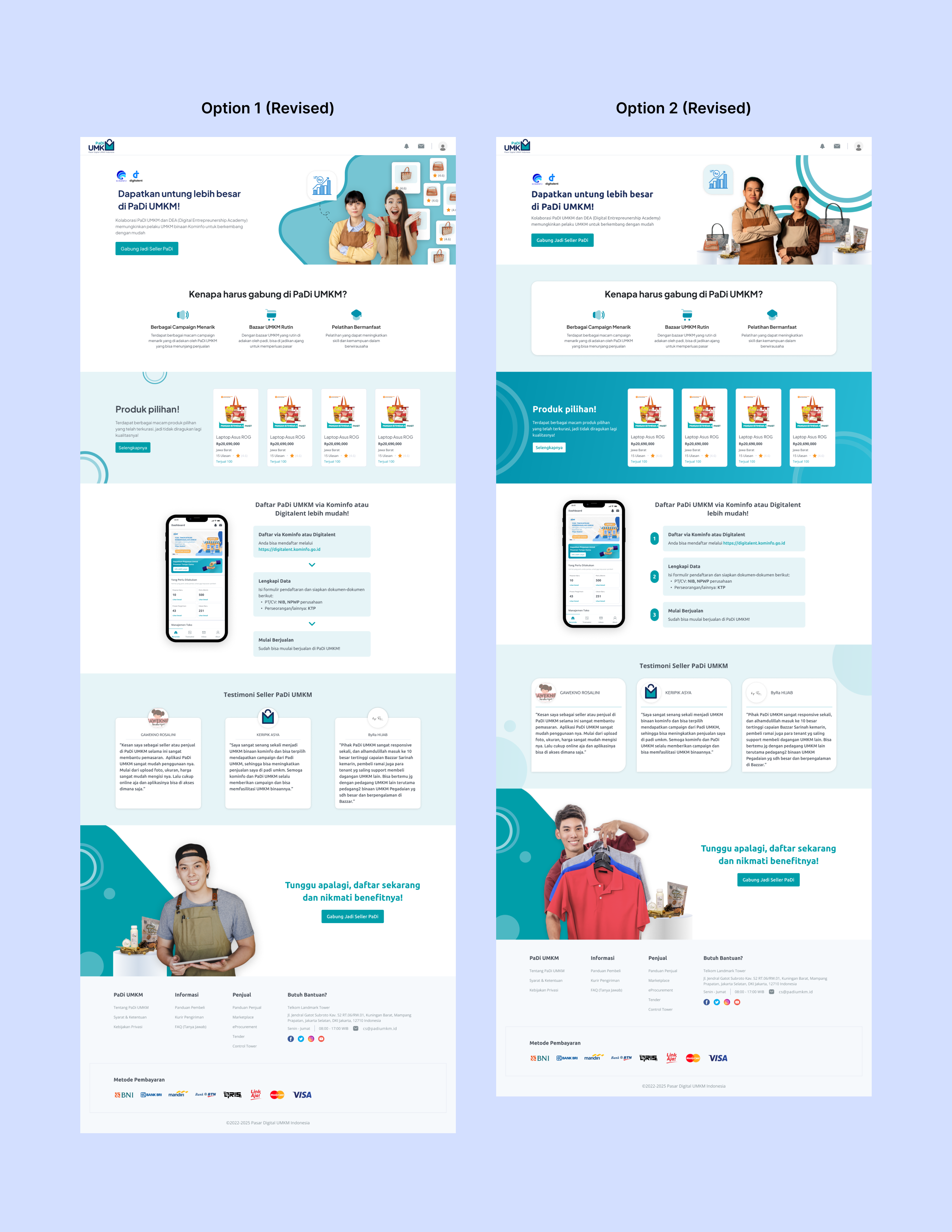
Design Revised
Option 2 is the choice made by my lead, with some image replacements in the hero section. Once the option is selected and finalized, I will proceed to create a responsive design for the mobile view based.
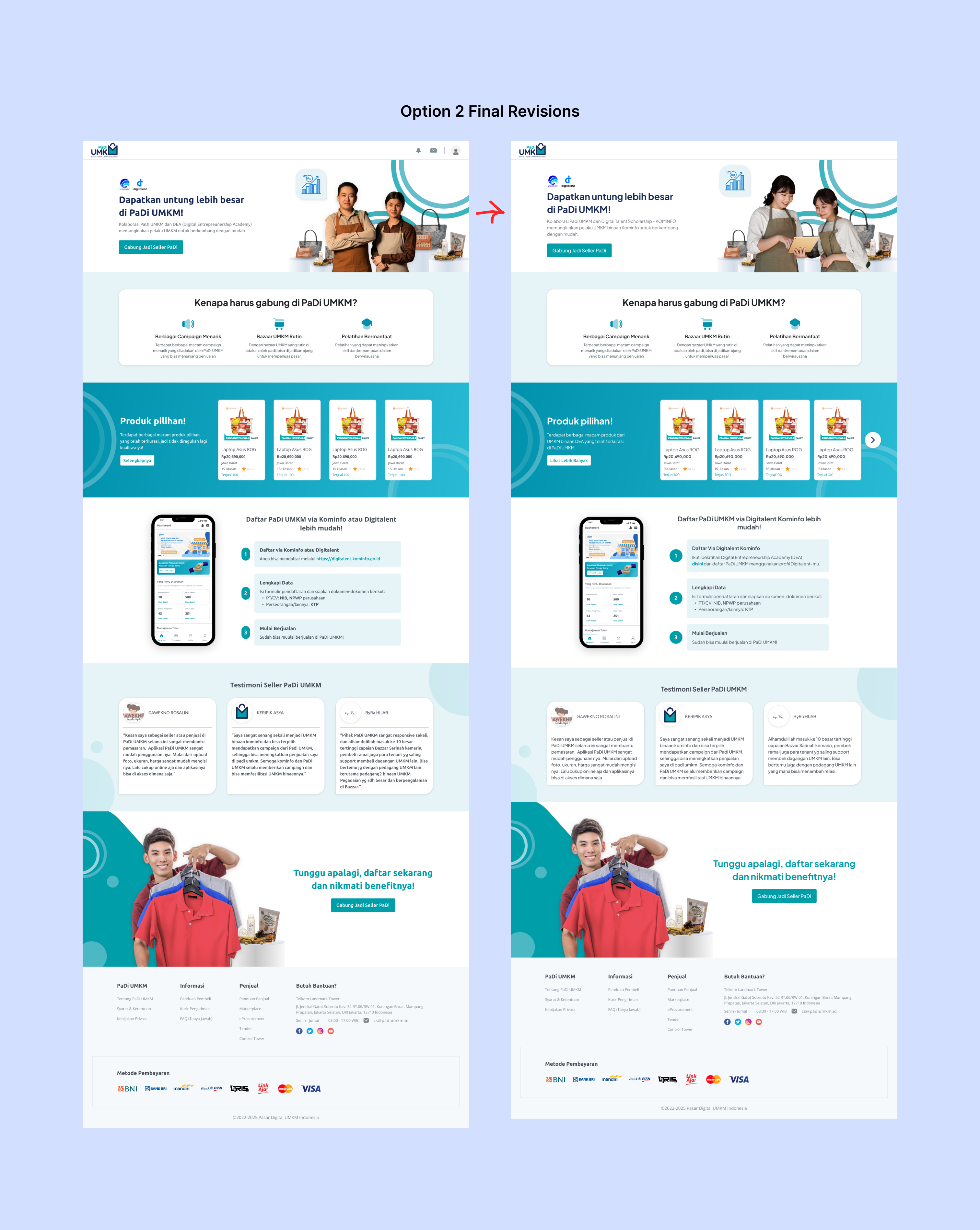
Final Revision
This is the final design and some screenshoot from the live version.
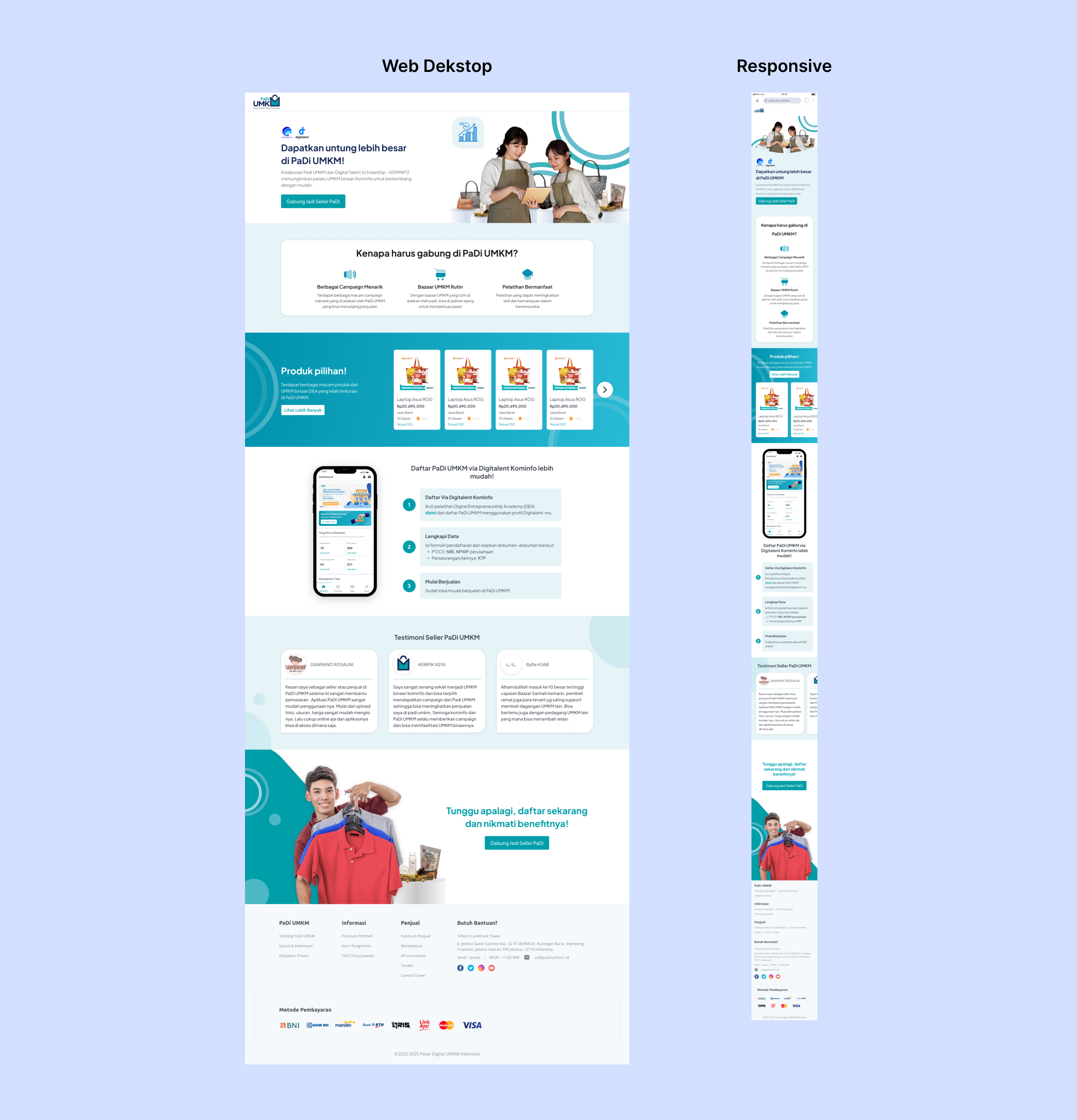
Final Design
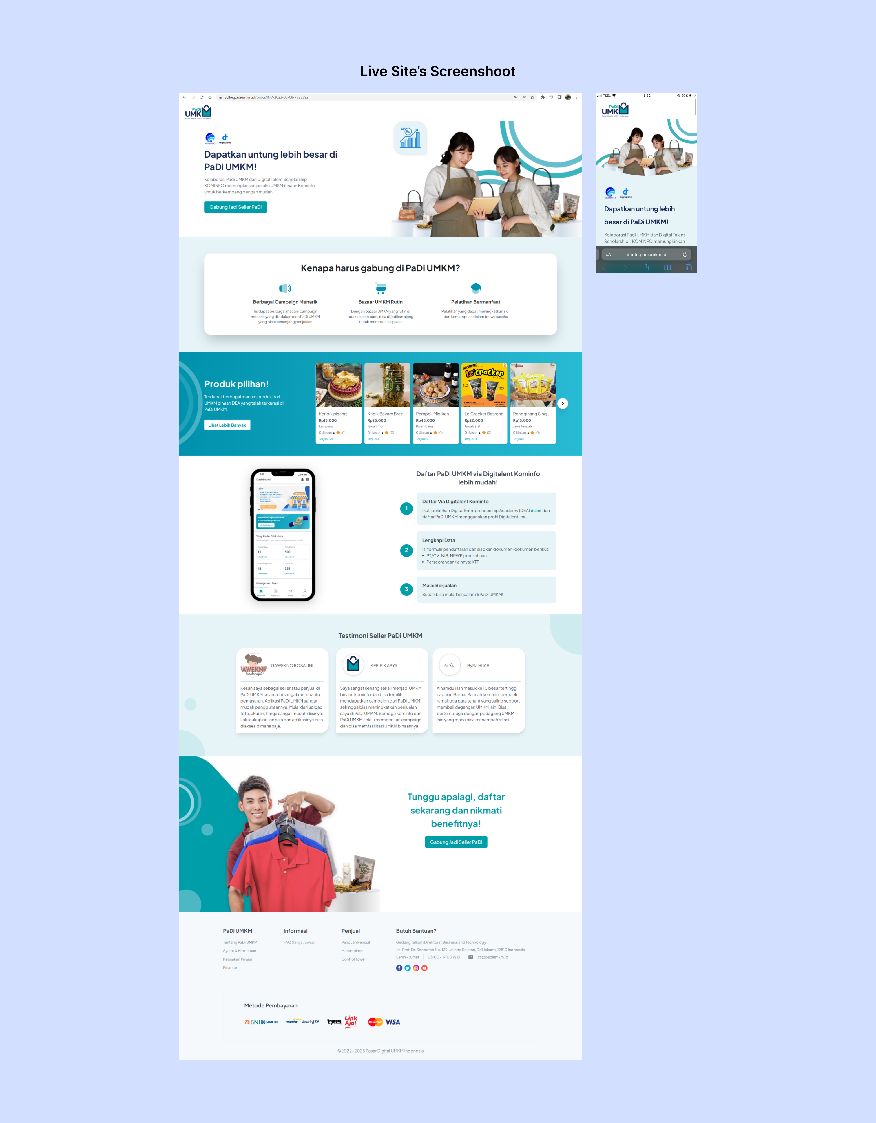
Live Site's Screenshoot
Thank You for Scrolling!👋🚀