Access to live site is restricted
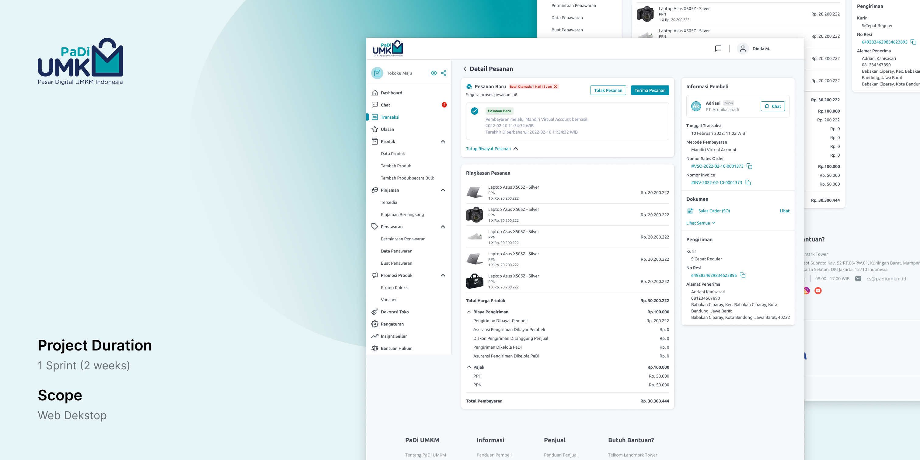
Padi UMKM is an Indonesian platform initiated by the Ministry of State-Owned Enterprises and developed by Telkom Indonesia to enhance the productivity and competitiveness of Micro, Small, and Medium Enterprises (MSMEs) in various sectors, including agriculture, manufacturing, and services. The program is designed to support the development of MSMEs in Indonesia by providing them with access to financing, technology, business training, and market linkages.
●
The increasing number of requests for transaction revisions and complaints by buyers is due to the tax discrepancies determined by the seller. Consequently, this has an impact on the customer service team and consumes resources from the engineering team.
●
Seller is having difficulty finding the transaction status history in the transaction details.
●
The document section position is too low, causing some users to have difficulty finding the desired document.
It can be concluded that the main problem is the layout placement of crucial information such as tax information, transaction status history, and documents, which leads to unclear of that information.
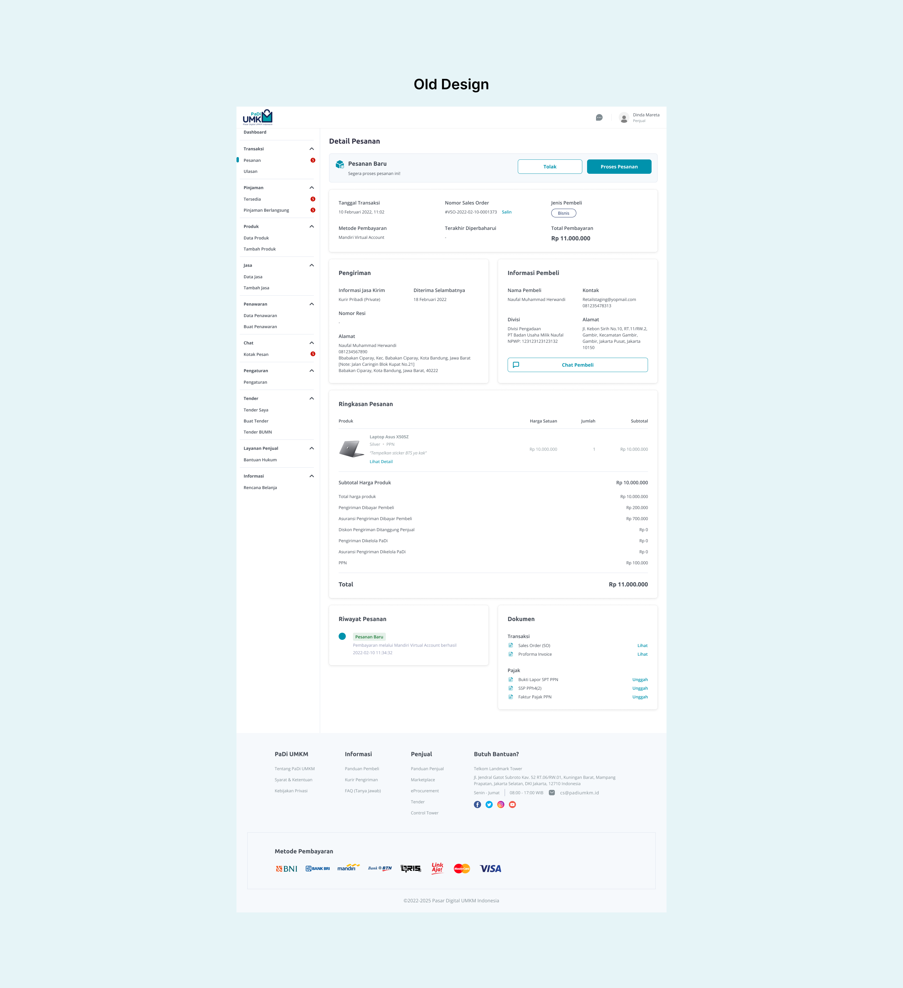
Old Design of Transaction Detail Page PaDi UMKM
●
Reduce complaints related to tax discrepancies on transaction details to customer service. This is to achieve the specified OKR with NPS metrics.
●
Seller finds it easier to locate transaction status history information on the transaction details.
●
Seller finds it easier to locate documents in transaction details.
As a UI/UX designer, these objectives will guide my design decisions and help me to create a page that meets the needs of the users and solves the problems identified in the problem statement. I need to ensure that the design provides clear and concise information about tax details, makes it easy to find and manage documents, and is intuitive and user-friendly. Additionally, i should design the page in a way that minimizes complaints and increases user satisfaction by addressing the identified pain points.
The users that are designing for in this project is sellers on Padi UMKM's platform. These sellers use the platform to sell their products and manage their transactions, so it's important that the detail transaction page provides them with all the information they need to fulfill their transactions and manage their businesses efficiently.
My role in this project is UI/UX designer, i create a new and improved transaction detail page for Padi UMKM's platform. This involves understanding the needs of the users (in this case, the sellers), analyzing the current user flow and pain points, and using this information to design a page that is intuitive, user-friendly, and efficient.
The requirements should be aligned with the objectives and scope of the project. During this phase, as a UI/UX designer i ask questions related to the problems faced by the product manager, the pain points, and the desired outcome of the redesign project. I also identify the user personas, their goals, and the context in which they interact with the platform. The requirements gathering process should result in a clear understanding of the users needs, the existing pain points, and the desired outcomes. It should also provide a clear direction for me to move forward with the next steps.
I’ve got some inspiration from the e-commerce transaction detail page that is has similar products with PaDi. In this process i focusing on the layout which is essential aspect of UI design because it directly impacts how users interact with a digital product or interface, i found some great visualization and i ended using some layout and design approach from these inspiration.
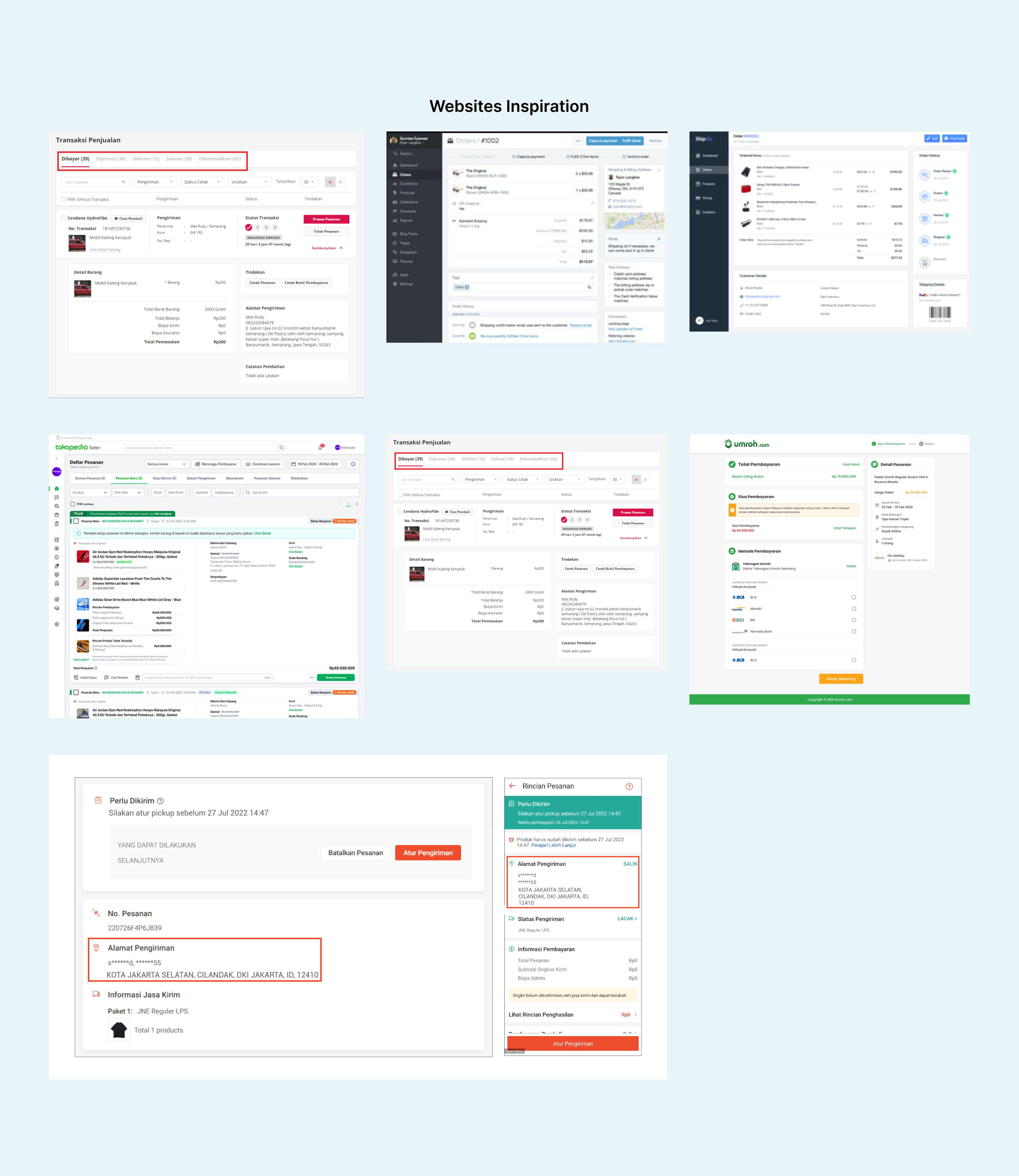
Web Inspiration
Information architecture can help me easily understand the content of the pages that I design in a structured way, and also facilitates me in presenting my designs to the stakeholders.
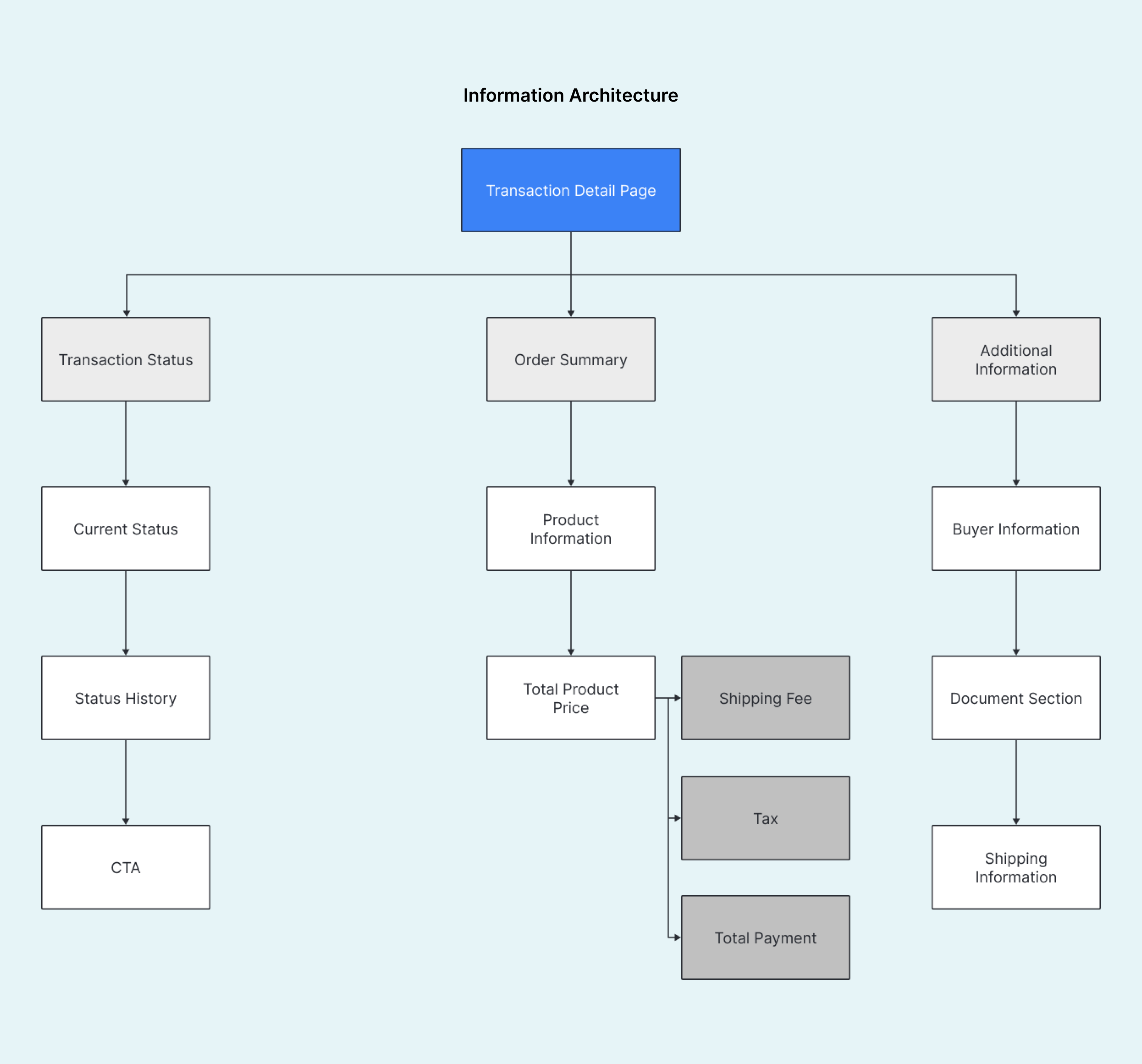
Information Architecture of Transaction Detail Page
The next process is sketching on paper based on the inspiration. Sketching on paper allows me to quickly experiment with different ideas and explore various design options without being constrained by the limitations of digital design tools. This flexibility and freedom can often lead to more creative and innovative ideas. I try to adjust the layout and made some design option to more easily decide the final design.
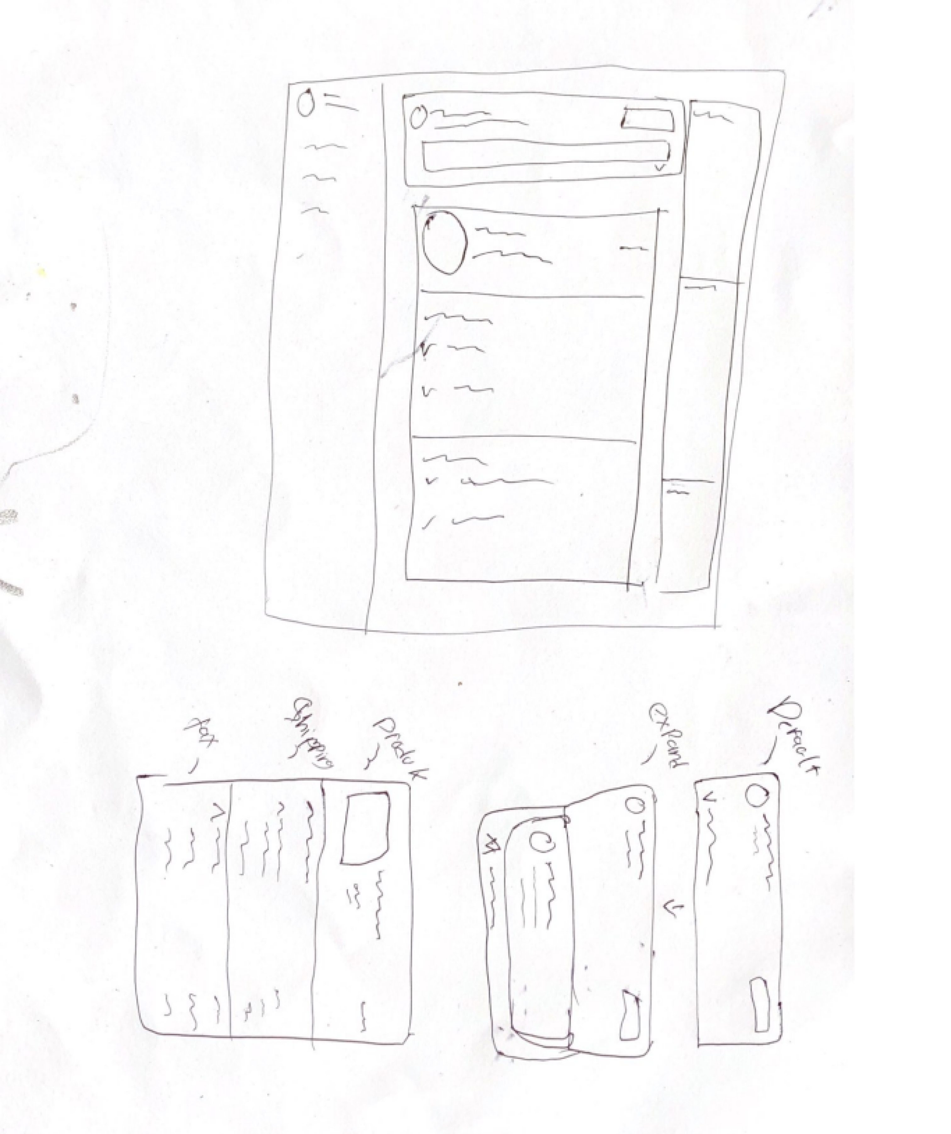
Paper Sketch
After sketching process, the next step is wireframing based on the layout I sketched, and my lead has approved this layout. I do some adjustment like grouping transaction status and transaction status history in one section, in the transaction summary i split the information of shipping fee and tax, and grouping the information of shipping and buyer in one section include document section. These adjustmend is based on the problem statement.
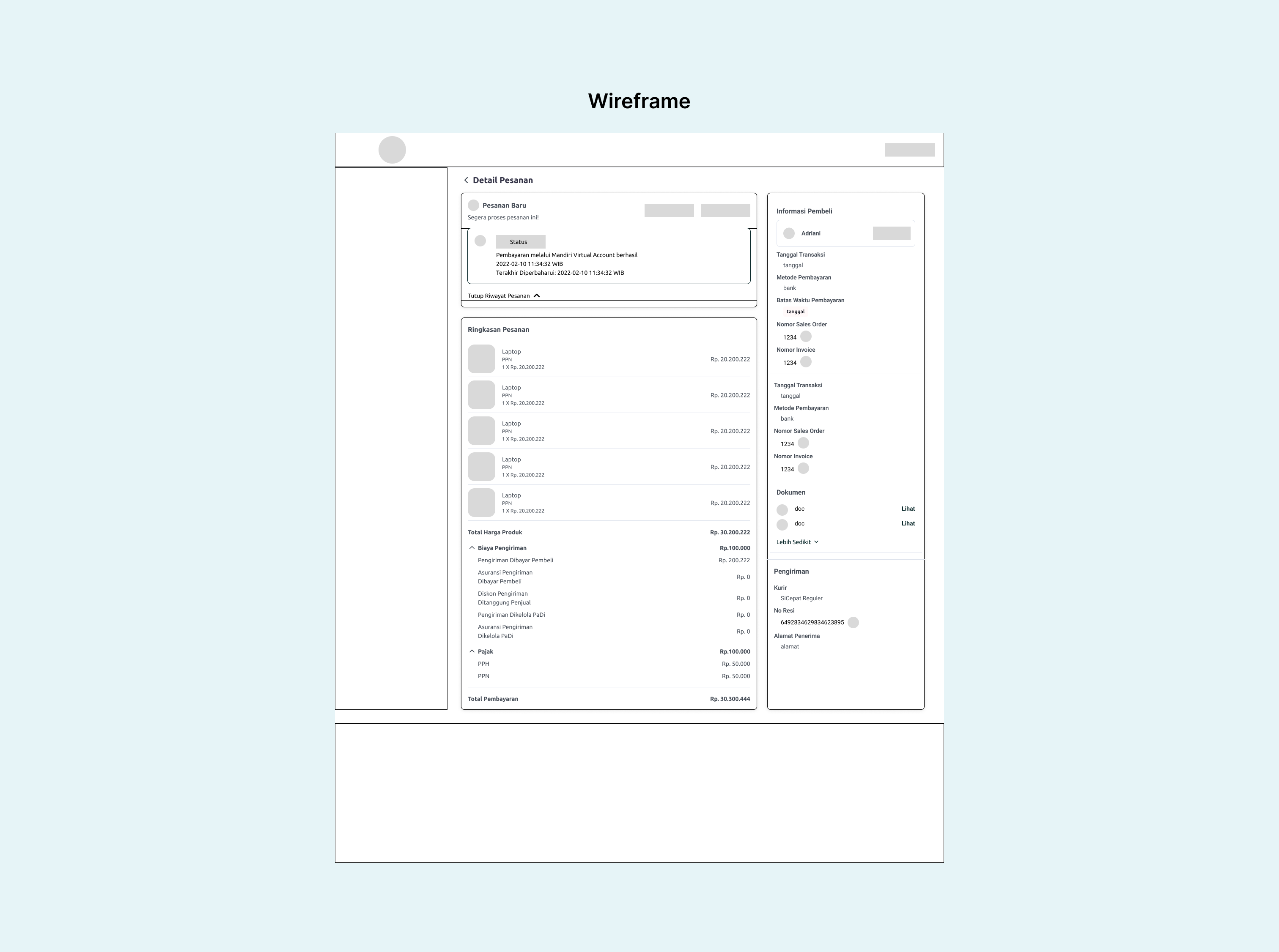
Wireframe
Utilizing technical method in figma can greatly streamline my workflow and enhance my overall design process. With advanced features such as auto-layout, properties, nested instance, and for design consistency i used PaDi's design system and also with atomic design to create a more structured and organized design process.
Other component like side navigation, header, and footer is from existing design in PaDi's design system.
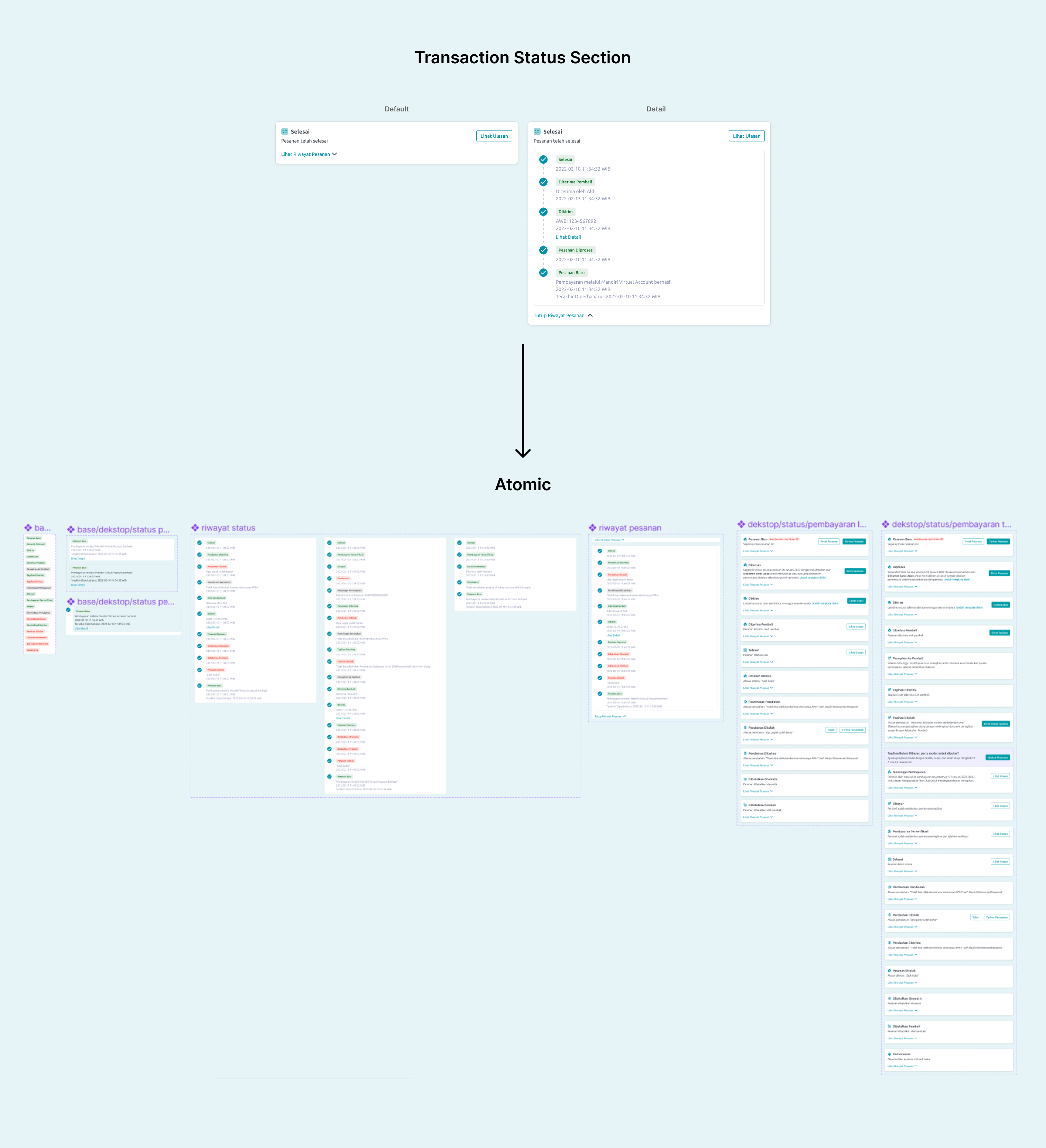
Transaction Status Section Component
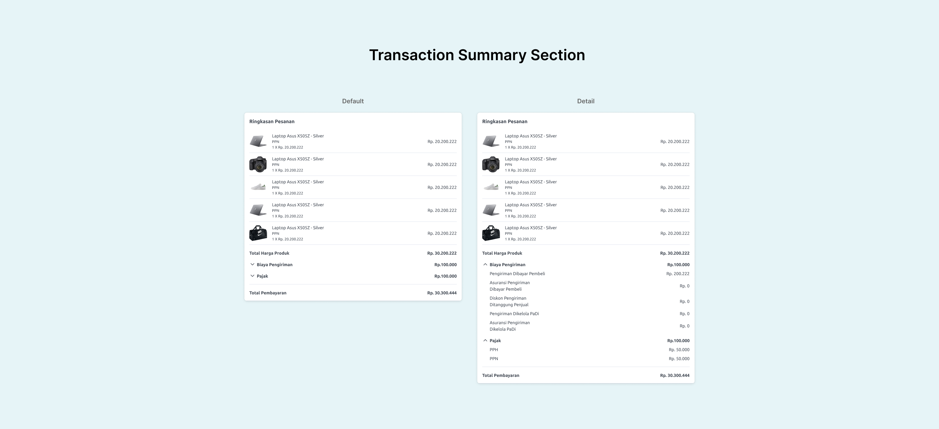
Transaction Summary Section Component
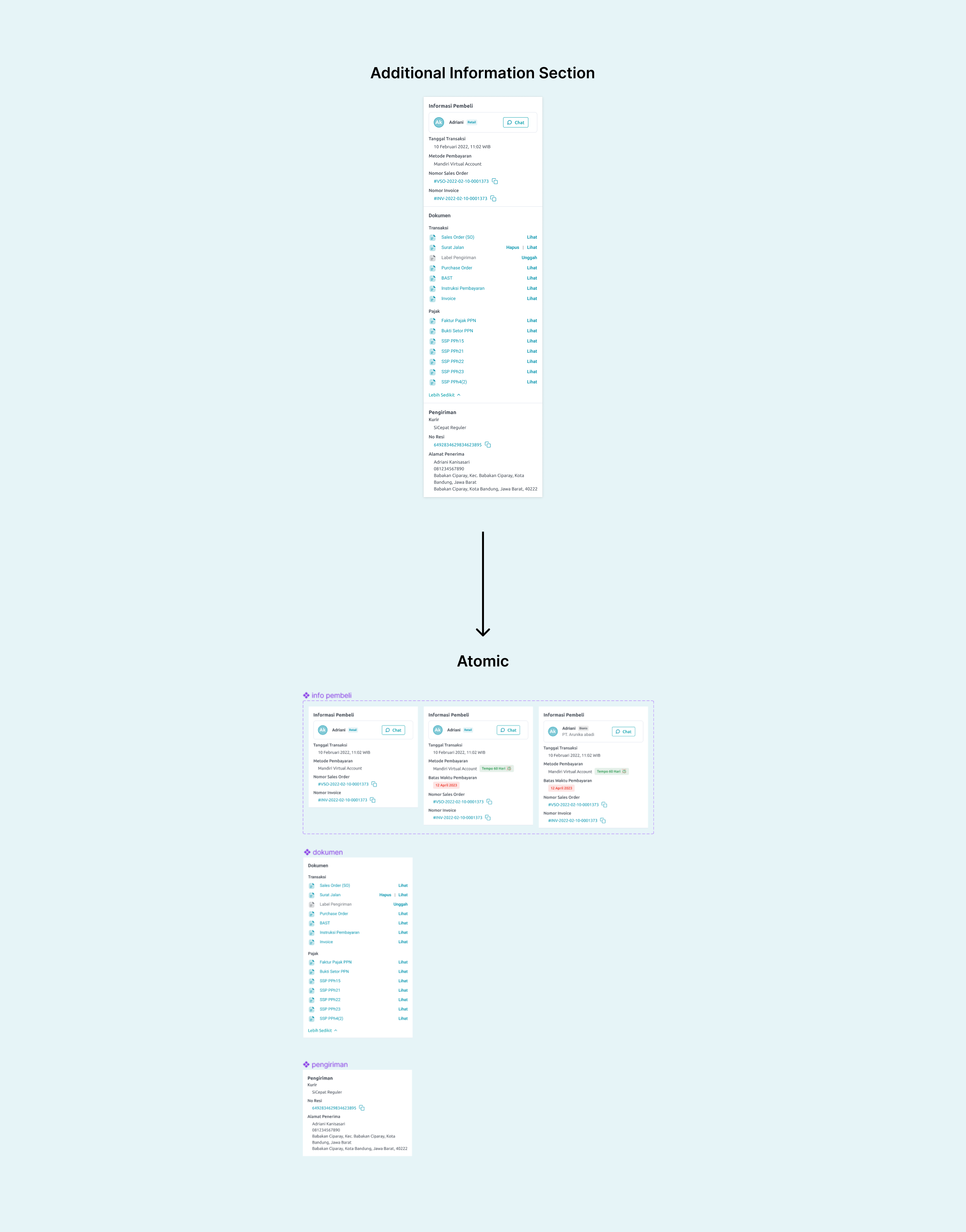
Additional Information Section Component
In the tax information section, i make it more clearly by categorizing it based on the type of information and separated by expand and minimize action.
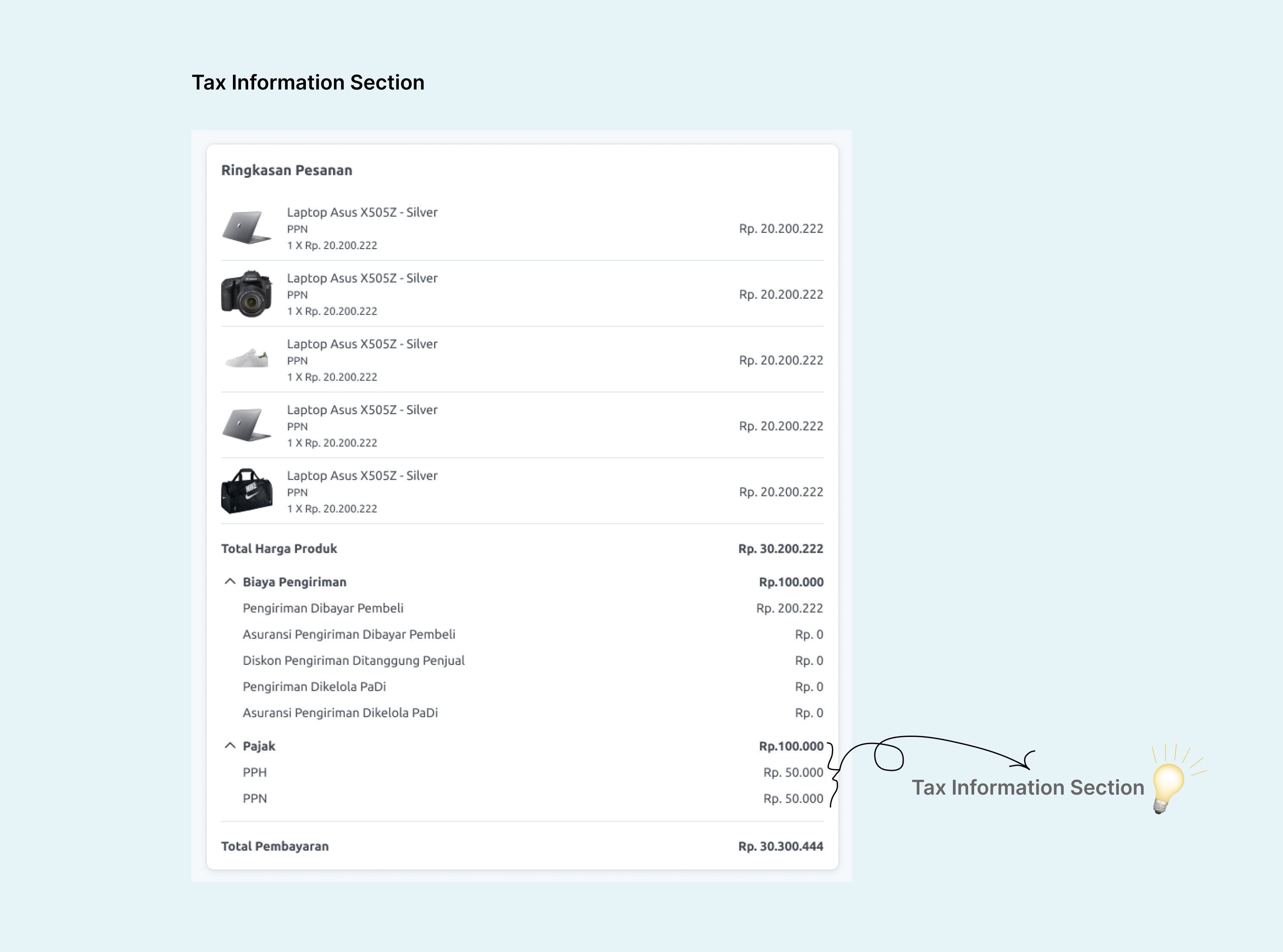
Tax Information Section
In this transaction status history section, I grouped it with the transaction status section so that its position is at the top of the page and make it more visible, as the transaction status history information has high priority.
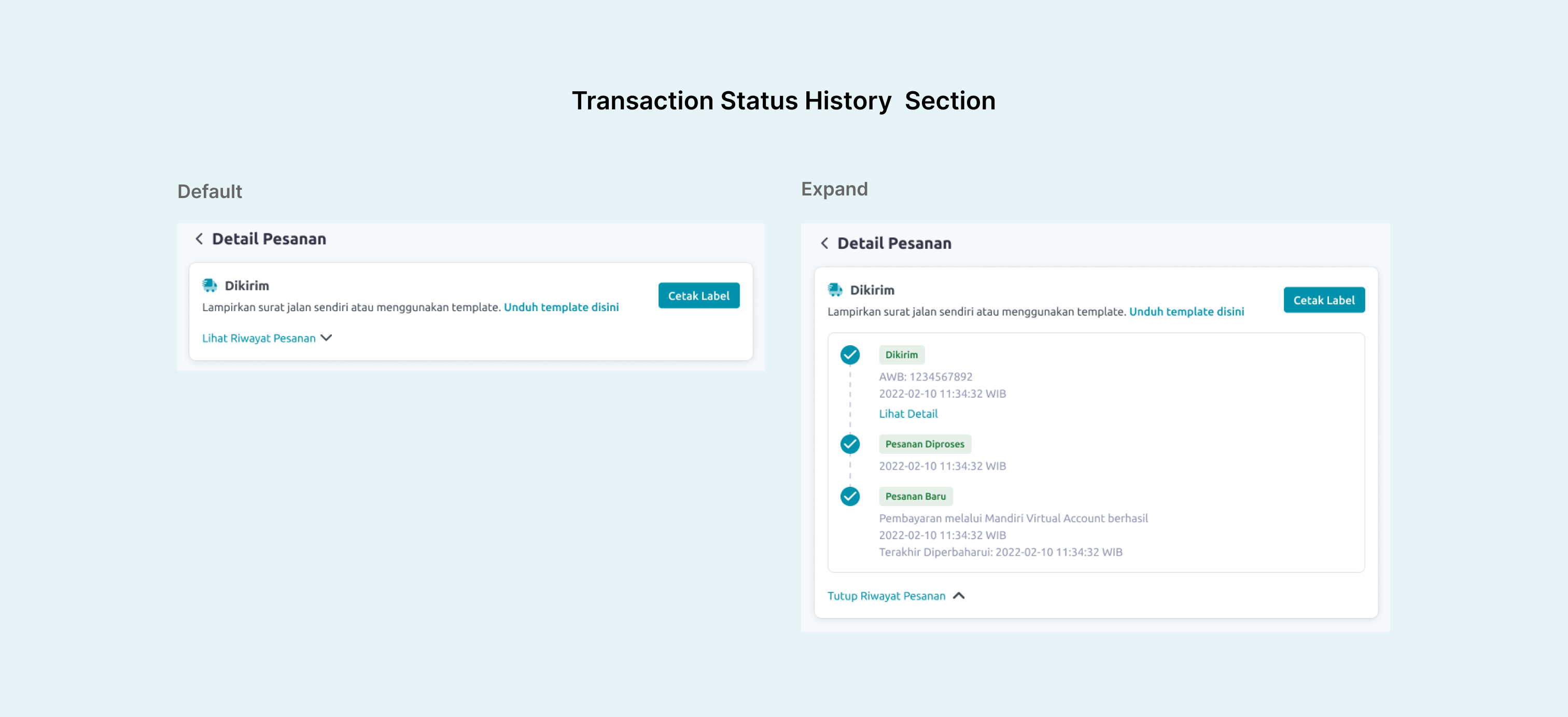
Transaction Status History Section
Previously in the document section, the position of document information was too low. In this redesign, i grouped the position together with additional transaction information and sorted based on priority. This improves the previous position and makes more visible.
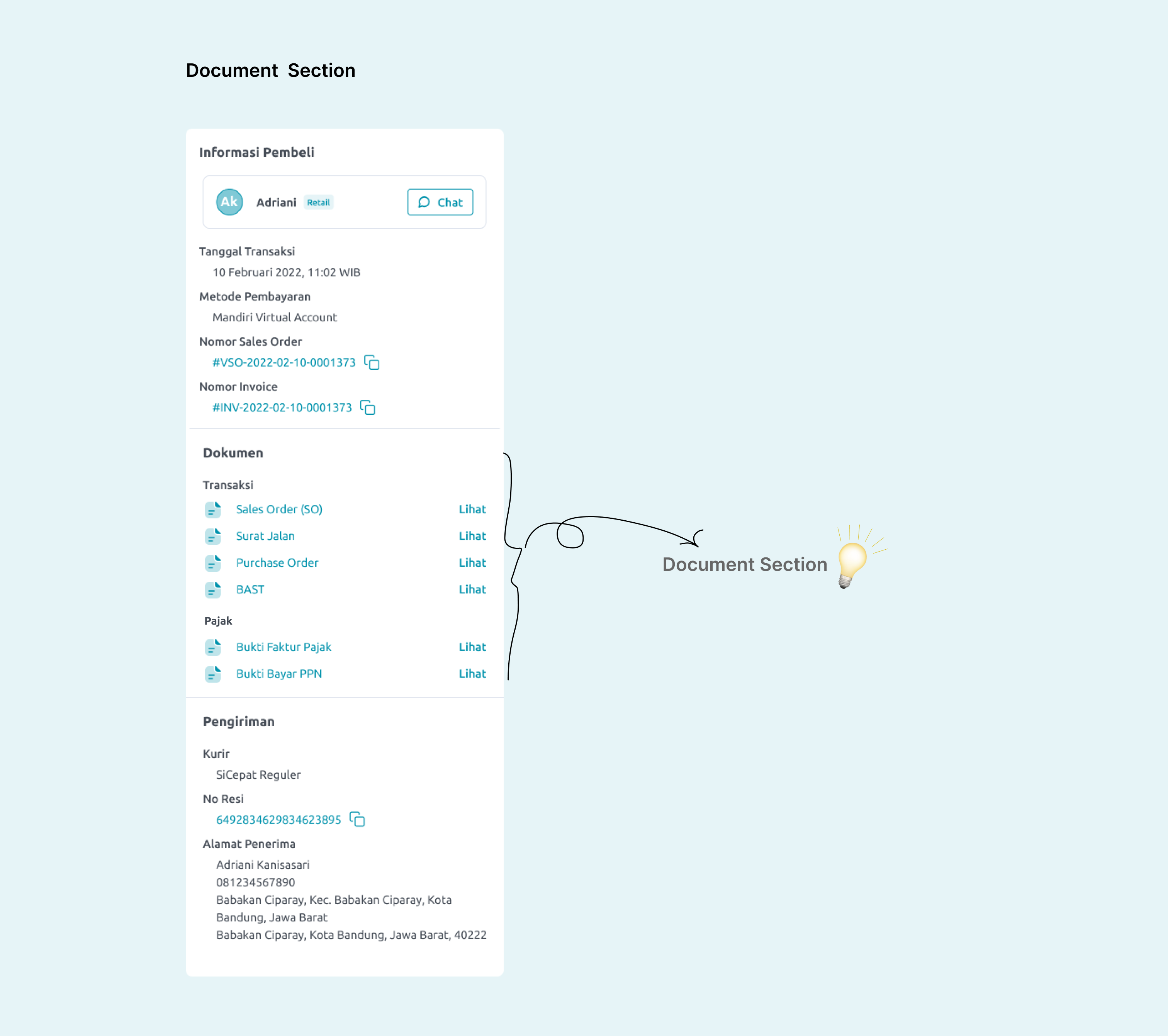
Document Section
This is the final design and some screenshoot from the live version.
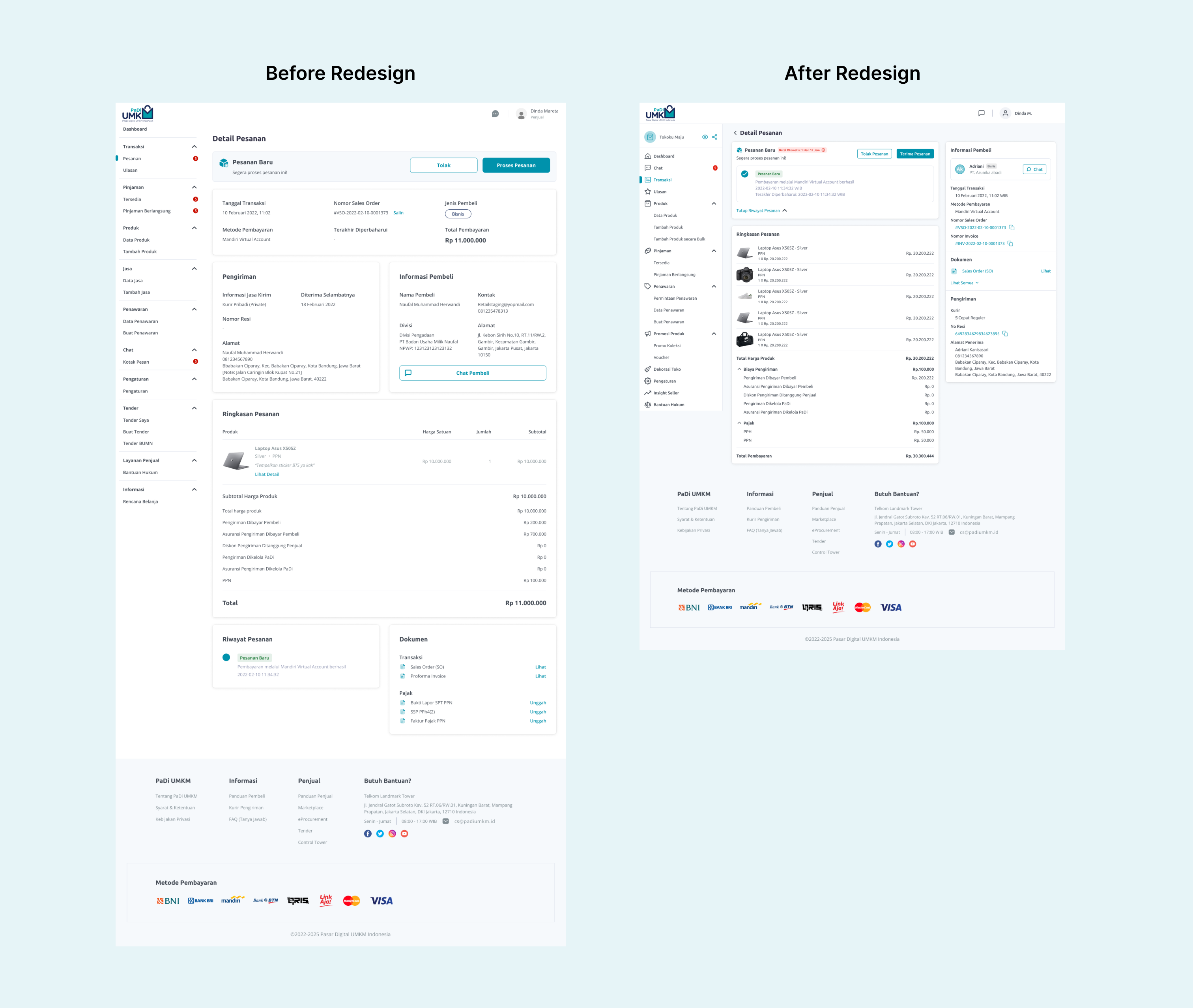
Comparison New Design
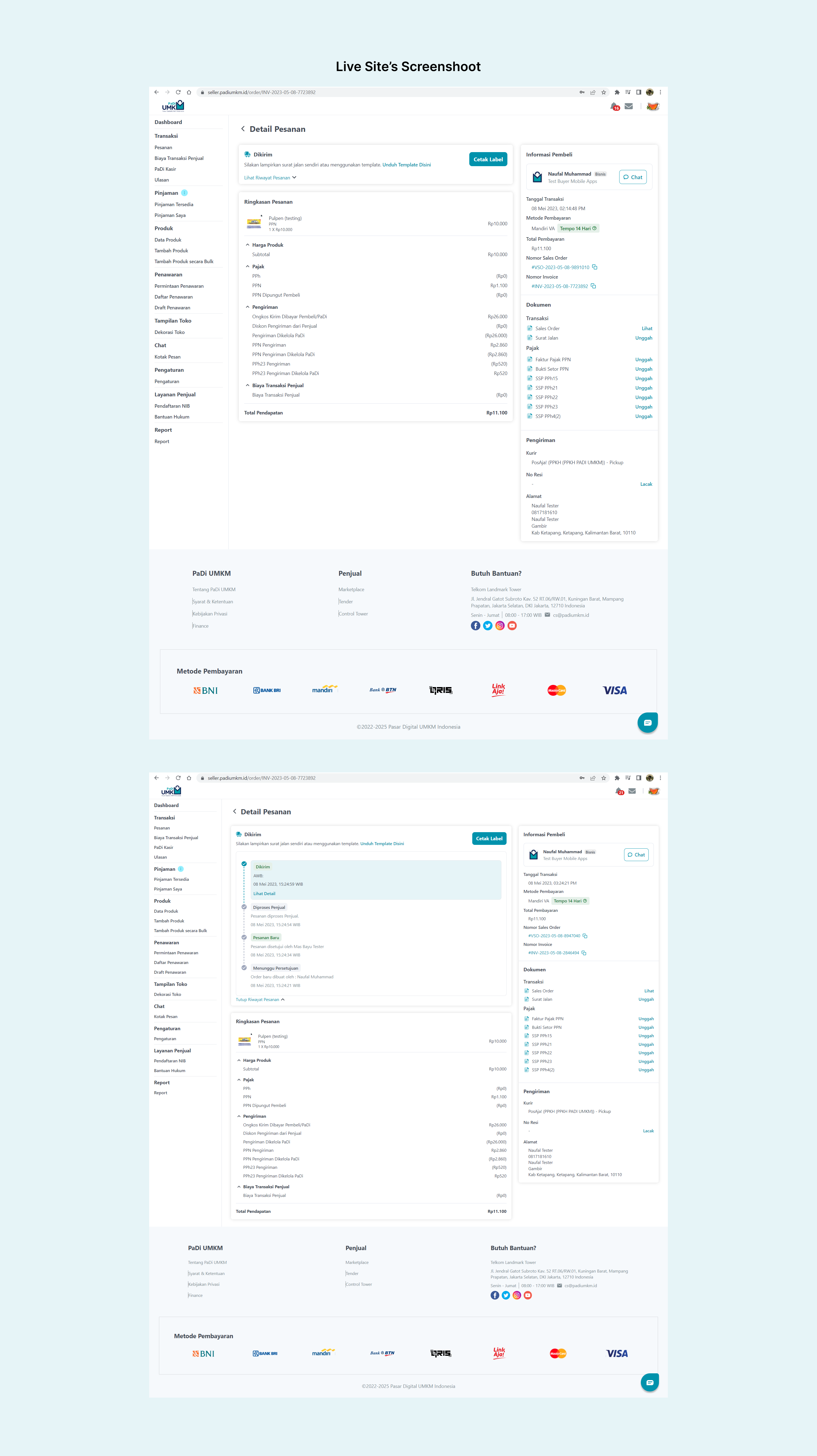
Live Site's Screenshoot
Thank You for Scrolling!👋🚀